Representing an old brand to new faces
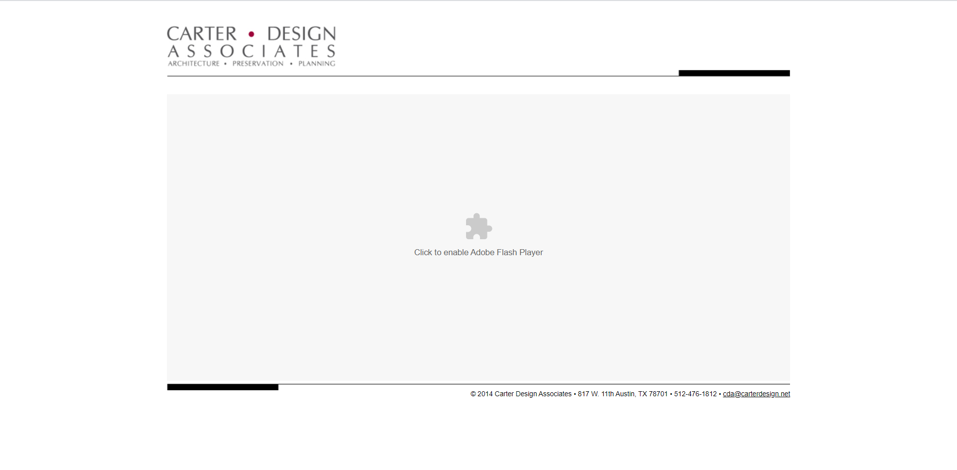
The Carter Design Associates website in it's current design state.
Project Overview:
Project Type:
- A conceptual project
- A website renovation and mobile app conversion
My Role:
My responsibilities for this project included user research, user flows & stories, sketching, wireframing, persona creation, visual design, and prototyping.
Project Date:
August 2021 - September 2021
Software Utilized:
Adobe Illustrator | Adobe XD | Invision
Donna Carter Associates is a Minority and Women business owned architecture firm operating out of Austin, TX. The firm is run by Fellow AIA member, Donna Carter, and their areas of expertise include Civic and Cultural, Commercial, Education, Entertainment, and Historic Preservation to name a few. The business has managed to maintain its reputation having provided over 25 years of professional service, but its online presence has done little in assisting this longevity.
This matters mainly because we live in a world where the majority of people are used to things being easily accessible. We enjoy the idea of instant information and everyday we see newer technologies and platforms arising to help us access that information. This kind of constant creation also forces businesses and organizations everywhere to keep up with the latest trends if they want to contend with the competition. Having an online presence matters and it is for this reason that we explore how to create such a presence for Donna Carter Associates.
Beginning the adventure
I started with my own assessment of the current website. It is currently a single page site that utilizes a flash video in order to show a slideshow of their projects. There is no real direction on how to proceed to the next part of the site or anything that would make you want to stay and browse the site aesthetically. After doing my own assessment my search, I thought it best to follow this up by observing other users in order to see how they engaged with the current site. The interviewees were subject matter experts consisting of three architectural designers and a civil engineer.
With the information I gathered from the observations and competitor analysis I created an experience map that highlighted the users’ pain points and suggestions for what they expected to see on a site like Donna Carter Associates' website. I found they experienced and questioned many of the same things that I had while utilizing the site. The data can be seen below.

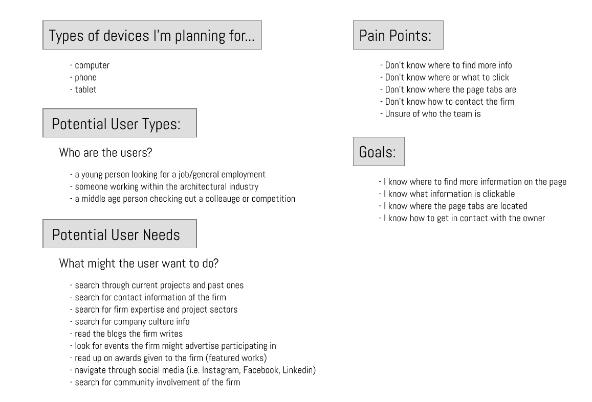
Experience map exercise (left) & Experience map findings (right)
The Push for Redesign
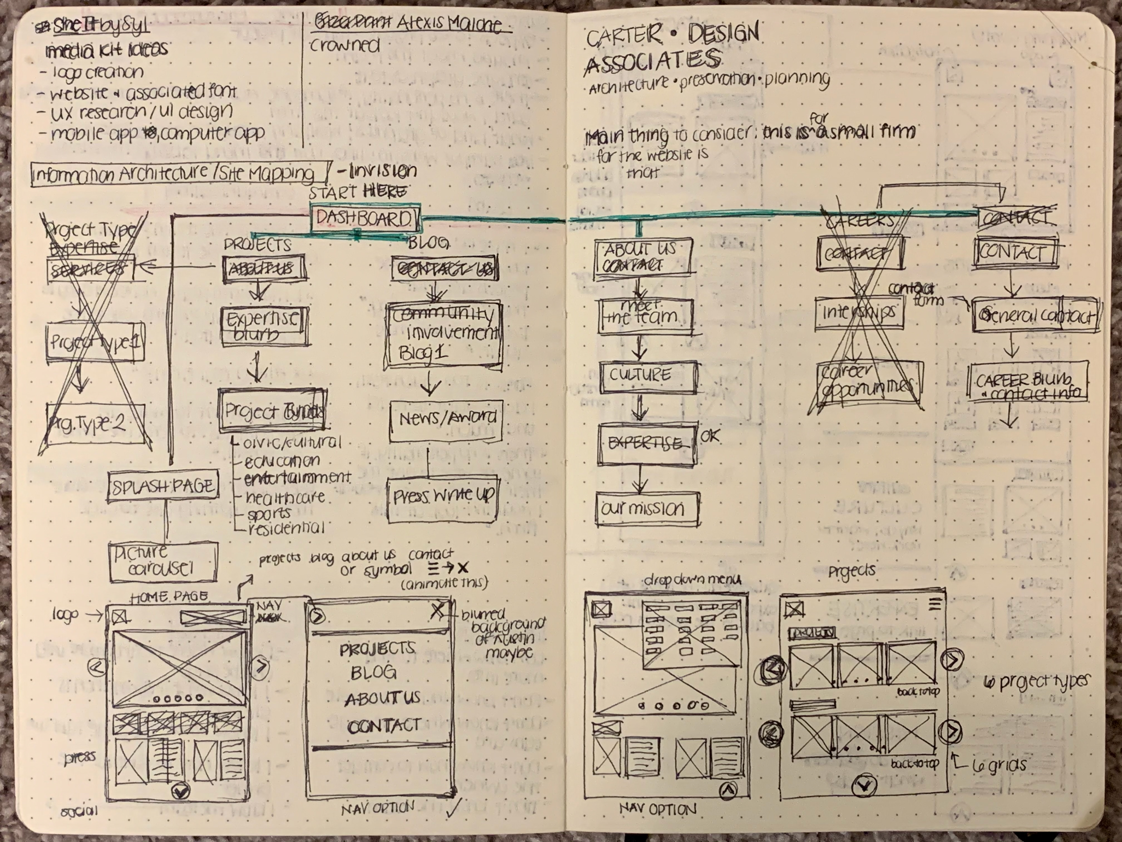
From the data I collected from all of my research and observations I created a persona detailing the type of person who would browse the site. I also did a bit of competitor analysis to see what other prominent architecture firms had on their websites and how they flowed. I specifically looked at websites for mid range to smaller sized architecture firms. I used all of this information to create flowcharts in order to loosely detail the redesigned site experience. From this point I was able to create low and medium fidelity wireframes that went more in depth with laying out the site for both a desktop and mobile interaction. This part of the process can be seen below.
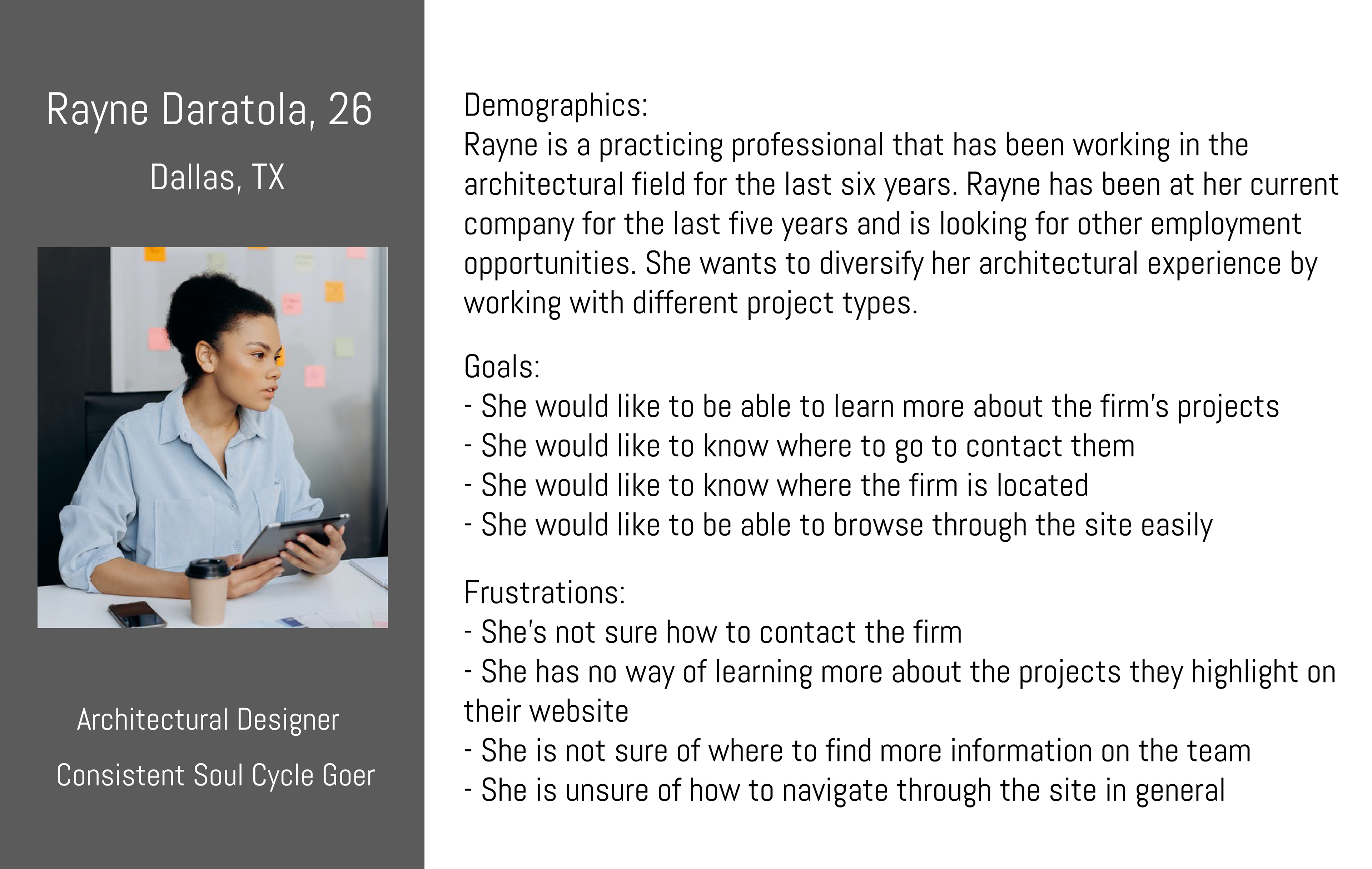
Personas created for the redesign
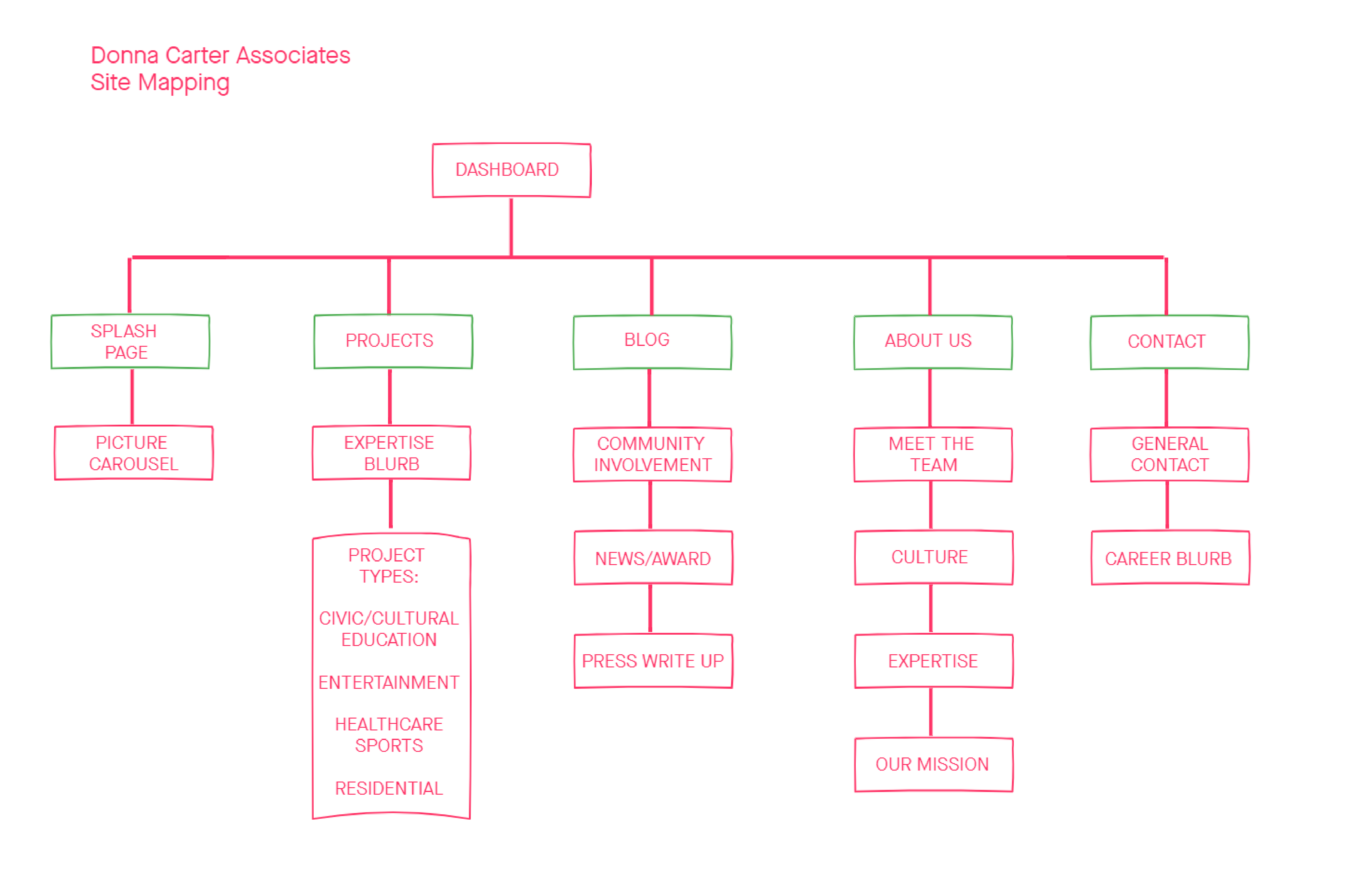
Web redesign flow chart
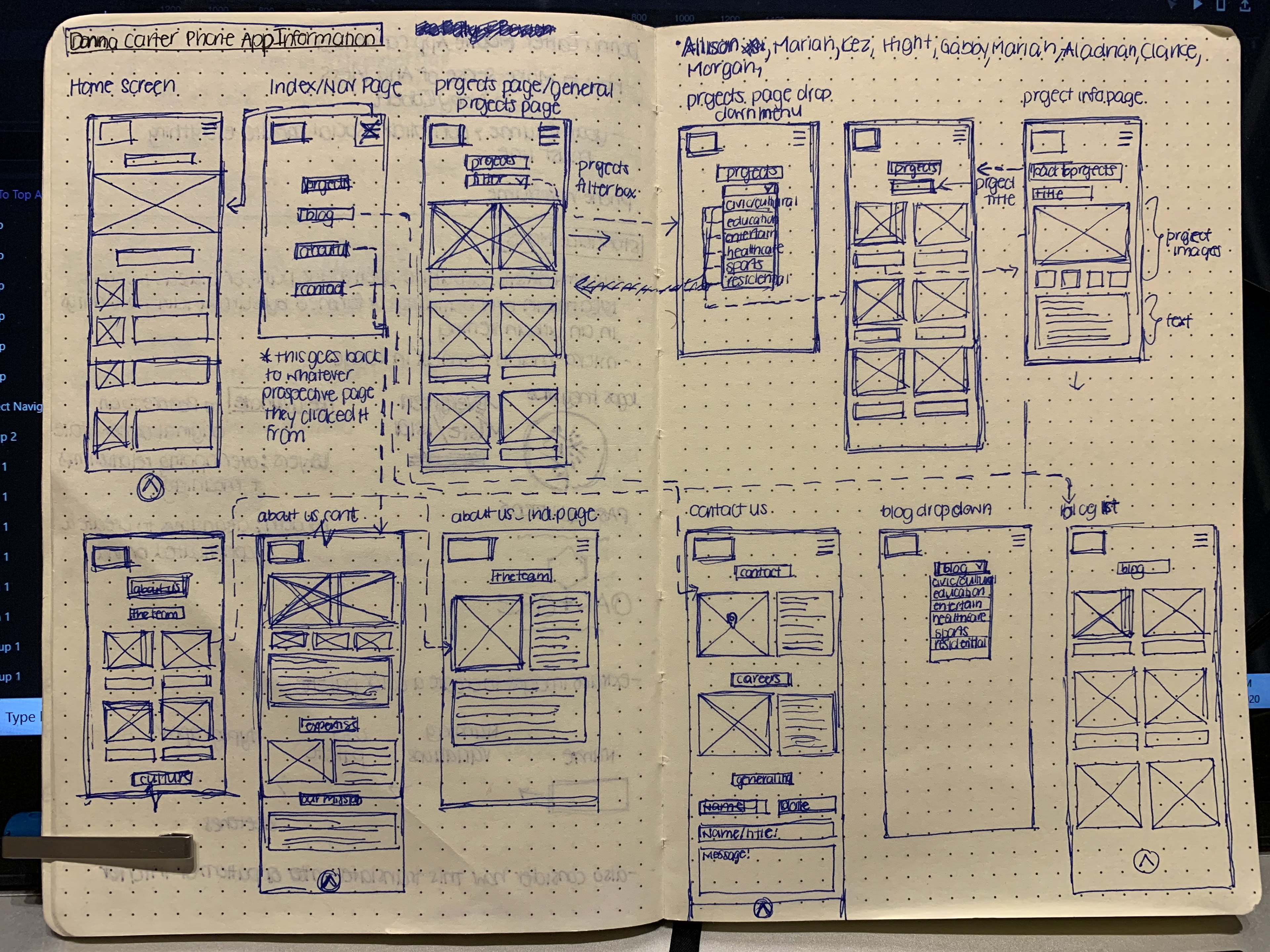
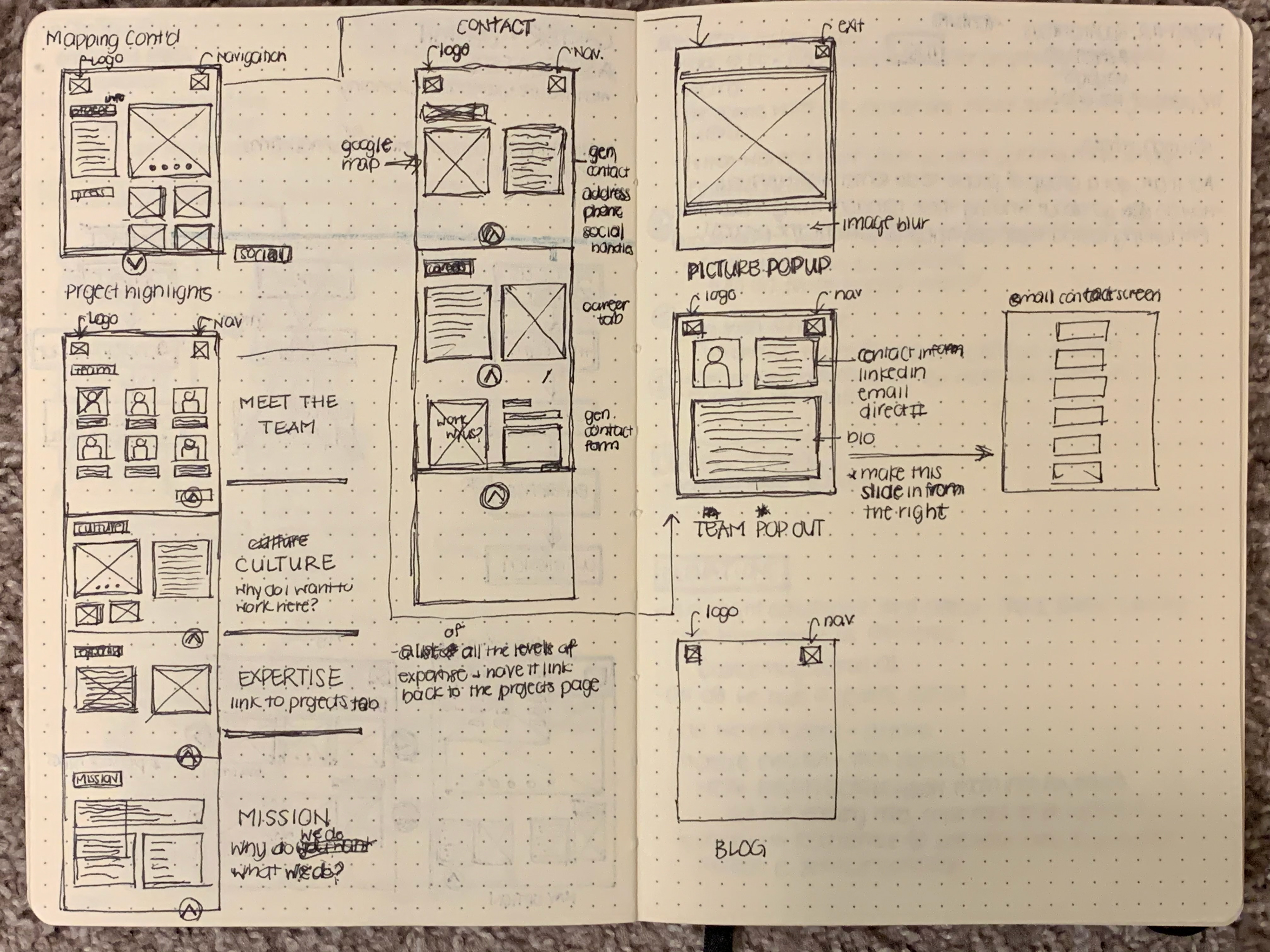
Low fidelity wireframe diagrams


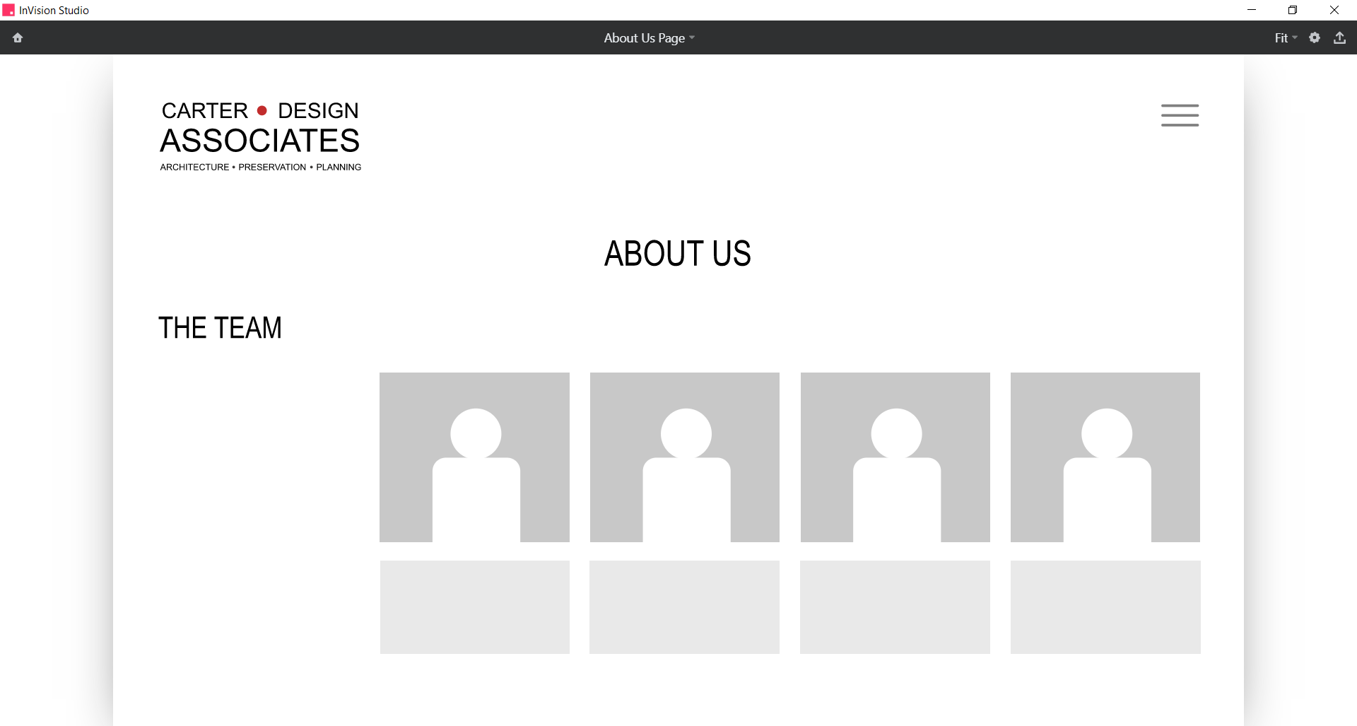
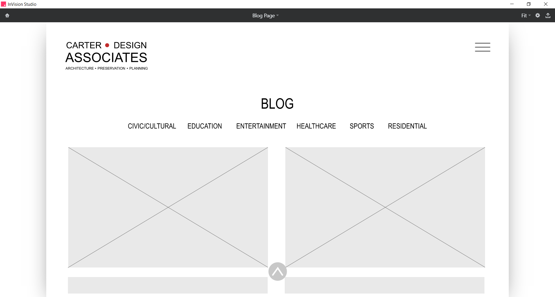
Invision medium fidelity wireframes for both web and mobile redesign
Finalizing the Design
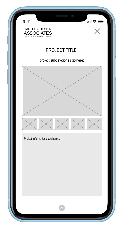
At this point of the process I wanted to take everything that I had learned and considered to create high fidelity wireframes. I decided to create a style guide that would keep the design consistent throughout. I decided to keep the idea of the existing logo and just revamp it. Since the firm already has a reputation within the architecture industry, I wanted to keep the logo familiar but updated. The leading accent color of red was also derived from the previous logo and used to select the remaining complimentary color palette. Lastly, in order to be cognizant of web accessibility each of the selected font colors were reviewed for their contrast according to Webaim. The style guide and samples of high fidelity wireframes for both the mobile and web application can be seen below. The high fidelity prototype for the mobile application can be seen here. Lastly, the high fidelity wireframes for the web redesign can be seen here.

Style Guide

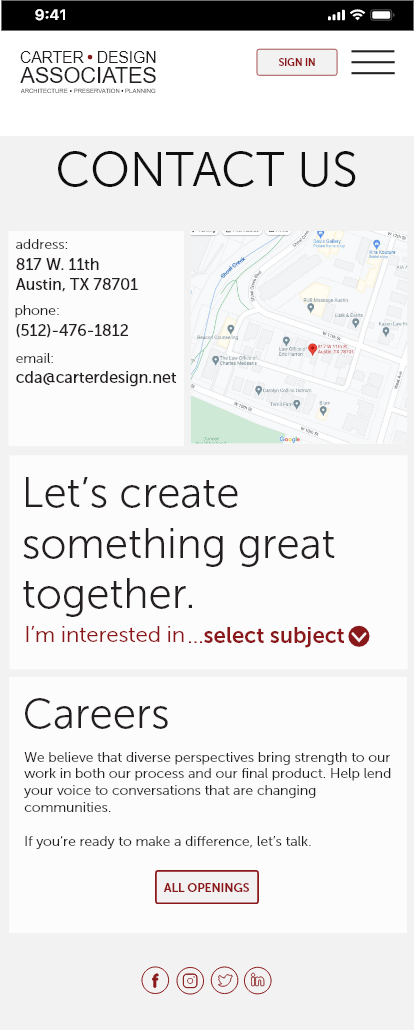
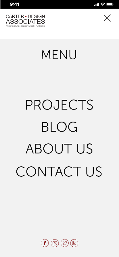

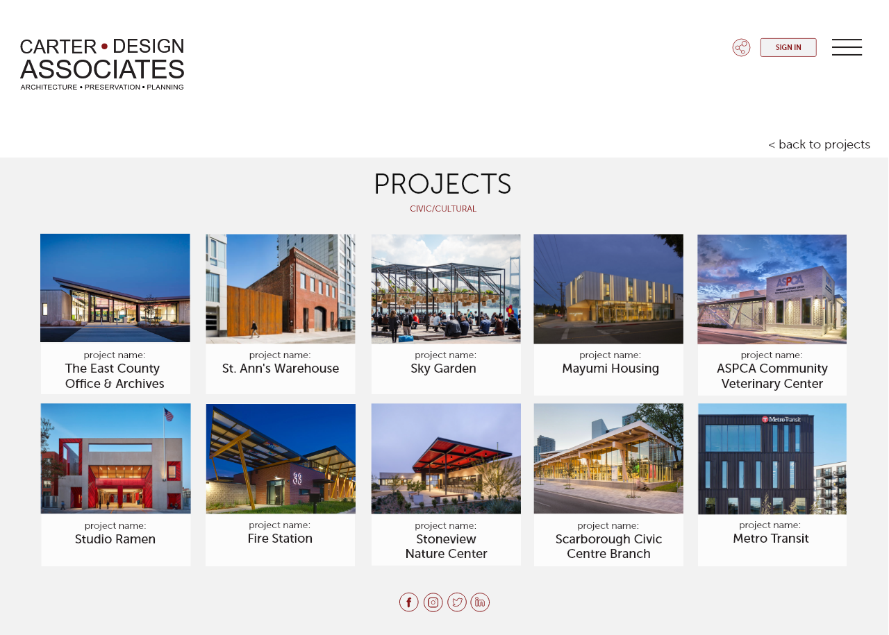
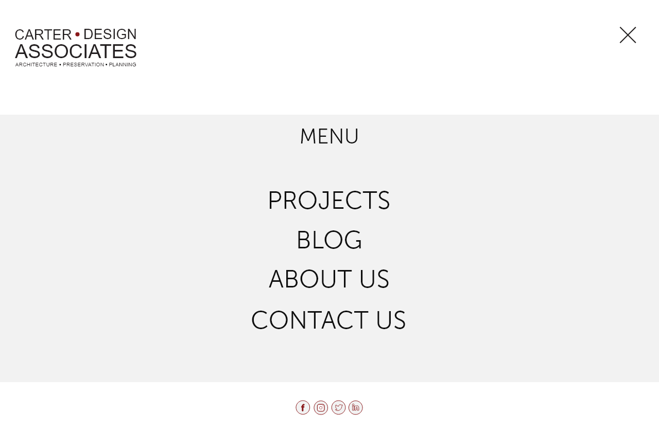
High fidelity wireframes for both mobile and web applications
Moving Forward
While I am happy with where the design has progressed to, I am still working on finalizing both mobile and web prototypes. Going forward I would like to continue to conduct user testing on both prototypes to get a general feel for how people actually navigate through them. I would like to do this to make sure that I addressed the pain points identified in the beginning of this process. I would also like to develop a tablet version of this design to ensure the device is responsive on multiple devices. Finally, I would like to present this to Donna Carter Associates, the true stakeholder, for their design feedback.