Project Overview:
Project Focus:
Public Sector | Product & Technical Advisory | Service Design | Systems Thinking | Human-Centered Design | AI integration
Project Duration:
February 2024 - June 2024
My Role:
Concept Lead and Experience Designer
Branding | Concept Generation | Iconography | Visual Communications | Wireframing | Usability Testing | User Research
Tools Used:
Figma | Mural (flows + prototypes) | Adobe Illustrator | Gemini
Impact:
Proposed a service model that reimagines unemployment support, prioritizing dignity, clarity, and empowerment for job seekers.
______________________________________________________________________________________________
The Challenge
When people experience unemployment in the state of Illinois, they are subjected to both an uncertain time within their lives and a daunting process ahead within the state. Unemployment systems are often transactional, bureaucratic, and stigmatizing — worsening stress during a vulnerable time. Our client wanted to improve that experience by re-vamping the end to end experience a claimant faces when filing for unemployment. This included rewriting the legalistic language in their correspondence that proved difficult to decipher, reimagining the touchpoints for delivering communication captured in some of the correspondence today, and determining an approach to communication maintenance by the client’s employees.
User Problem:
Job seekers face confusing processes, legalistic and confusing documentation, long wait times, and a lack of emotional validation. State employees are buried under outdated processes and desire to improve confusing unemployment insurance communications.
Design Question:
How might we design an unemployment experience that is more empathetic, supportive, and streamlined for both the claimant and employee?
______________________________________________________________________________________________
Approach & Process
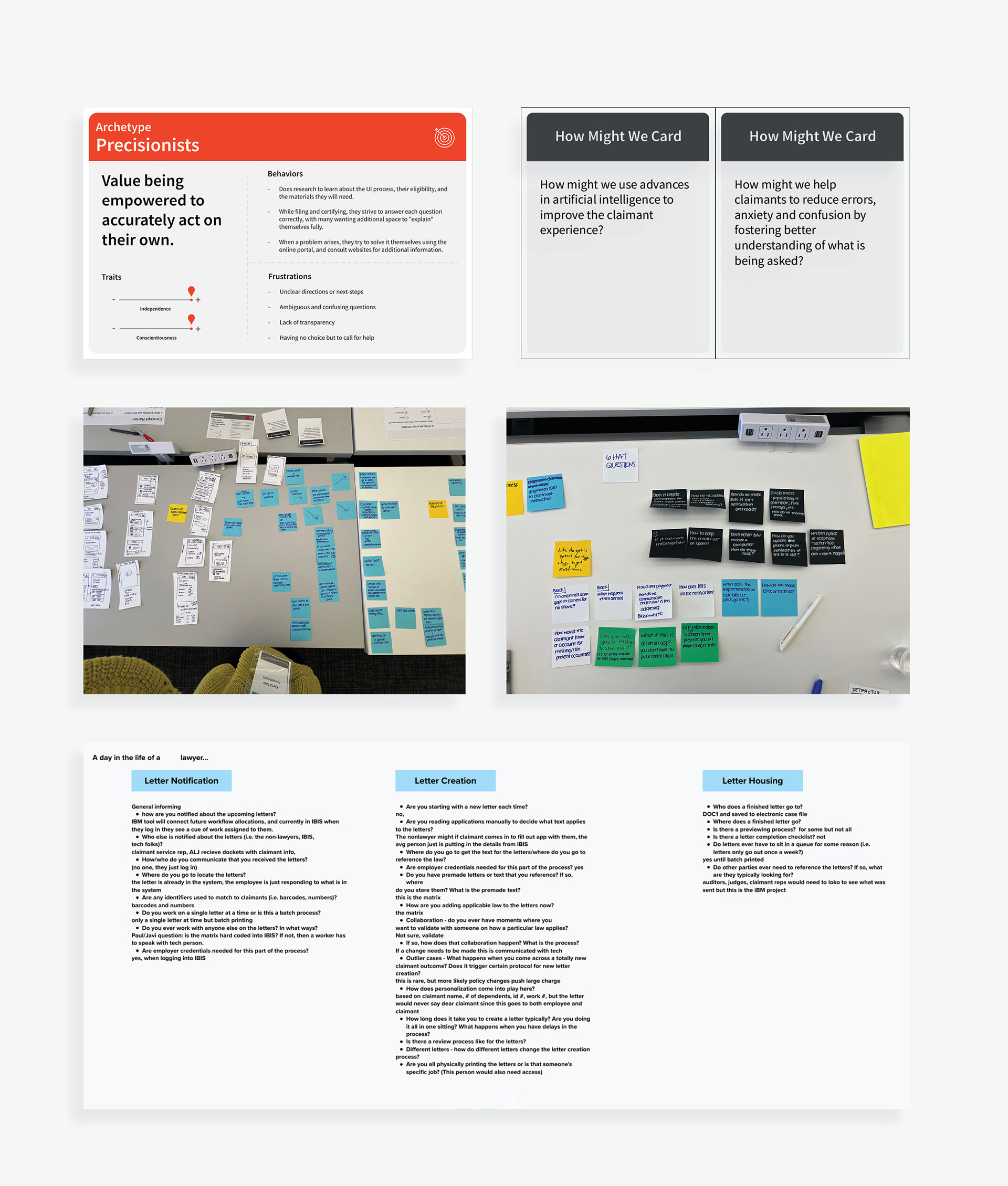
From previously conducted user interviews with claimants, we learned of several pain points from the claimant perspective. Some of the highlighted pain points were their difficulty in understanding the correspondence letters they received, failing to get adequate support, and a lack of clarity regarding the whole process.
After gathering insights from the claimant perspective, the team desired to learn of and solve the problem from the employee perspective as well. The intersection of these insights informed our team that the best areas of focus would be to improve the employee ecosystem by updating their current correspondence, creating an employee content authoring tool equipped with AI capabilities, and creating a way to gather performance analytics. Improvements in these areas would prove to have the best lasting impact for the client. In order to prove this out to the client I contributed as a user researcher and experience designer in the following ways:
1. Research & Insight Gathering
In this area I assisted the lead researcher in gathering valuable insights from the employee perspective. The main insights from these interviews highlighted outdated processes that prevented efficiency, inconsistent methods of inputting information, and extreme delays when updating any documentation. These insights highlighted the need for the tool the team was proposing. I contributed to this area in the following ways:
+ Co-conducting user interviews with claimants and employees to uncover pain points (shame, legalistic language barriers, unidentified metrics for success) alongside the lead researcher
+ Synthesizing research insights that would assist in the development of our user archetypes and further define our project deliverables
+ Co-facilitating an ideation workshop that engaged stakeholders and increased their buy in for the authoring tool we proposed
+ Partnering with a UX copywriter to ensure cohesion in the updated correspondence designs
2. Concept Development
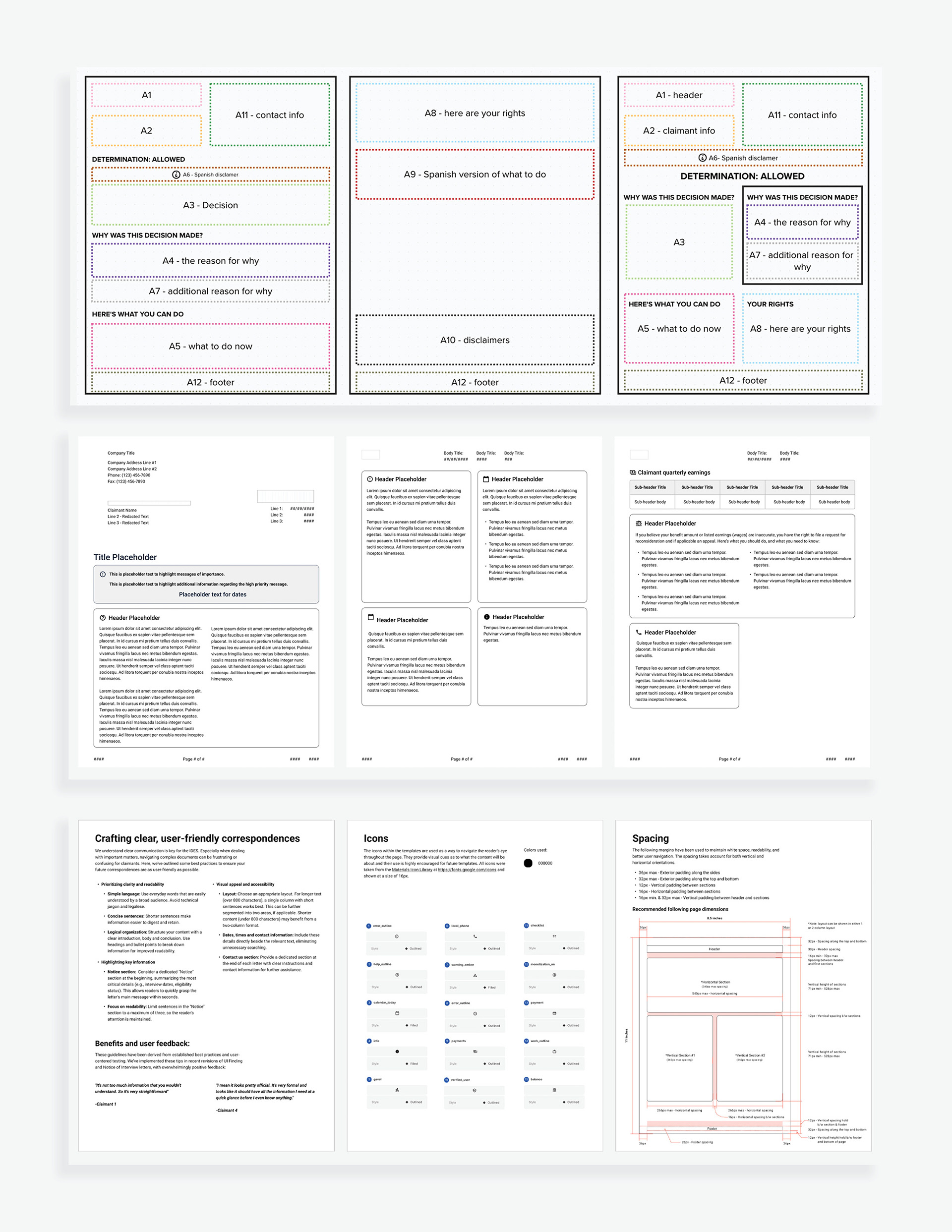
We learned from the client that a total of 2 million pieces of correspondence were sent out to claimants, and of this there were 86 different types of correspondence that could go out. We also learned of some of their pain points around their correspondence. This included bottlenecks in their document review due to varying reviewers and extreme delay times due to third party and law body reliance to name a few. So given the sheer volume of correspondence and the problem space, there was a lot of opportunity surrounding the client’s correspondence. Improving their most popular forms of correspondence was my area of focus. I played the design lead and contributed in the following ways:
+ Redesigning and restructuring 7 existing communication correspondence that would incorporate affirming and comprehensive language while providing a base for improved communications.
+ Pairing with a UX copywriter to ensure cohesion between the improved language and page restructuring
+ Leading internal team feedback sessions to encourage collaboration and foster team buy in regarding the updated correspondence.
+ Creating a visual branding identity referencing best design practices (accessibility, iconography, structural hierarchies) that would maintain the client’s brand consistency in future correspondence and throughout their authoring tool
3. Prototyping & Storytelling
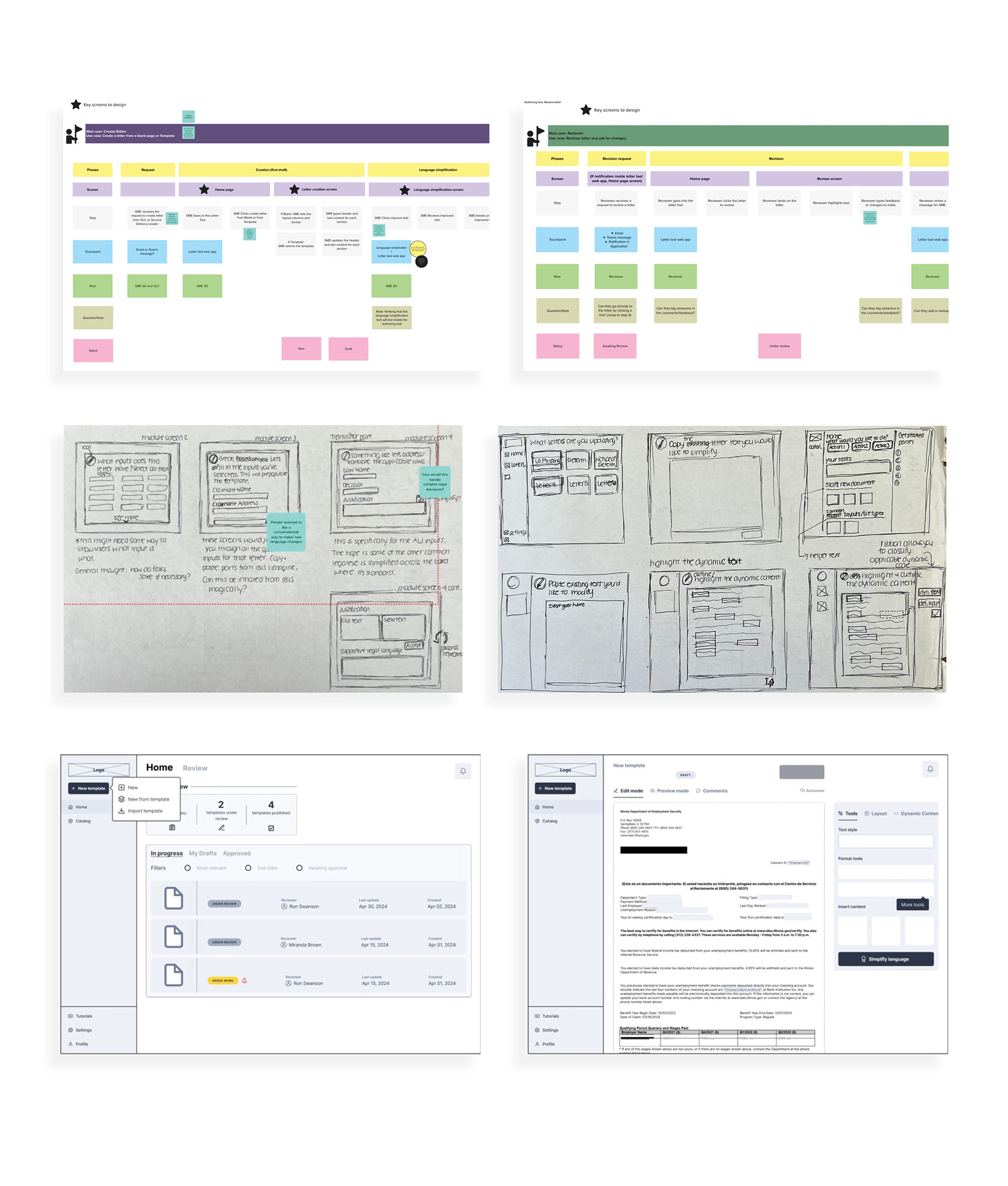
Alongside improving the client’s main pieces of correspondence, the team proposed the creation of an authoring tool that would streamline the process of creating communications. It would replicate the process we had gone through (i.e. designing and restructuring the correspondence, updating the language to adhere to federal guidelines while utilizing Gemini, and ensuring the appropriate review channels were in place) all within the same authoring tool. For this portion of the project, I partnered with another designer to conceptualize this tool. The specifics included:
+ Sketching and building low-fi prototypes of the digital portal that were used to gain internal team and client consensus and for research sessions
+ Crafting narrative visuals (i.e. presentations, design artifacts) to demonstrate how a multipoint system would feel from a job seeker’s perspective.
+ Refining and improving design concepts by working closely with another designer, incorporating continuous feedback to optimize visual and functional elements.
+ Articulating design rationale and key decisions to executive stakeholders alongside our project leads, driving understanding and buy-in for the final deliverable while securing 100% sign-off on a future phase of work
______________________________________________________________________________________________
The Solution
After employing the approach and processes, the team delivered 7 updated letters of correspondence that the client could utilize, a style guide outlining the maintenance of future pieces of correspondence, and an understanding of the art of the possible concerning a future authoring tool that could streamline their processes. The team would go on to secure a future phase of work to continue exploring the development of the tool beyond my time on the account.
______________________________________________________________________________________________
Impact & Outcomes
+ Conceptual Insight: Demonstrated how empathy, when embedded at every stage, could reshape an entire unemployment system.
+ Practical Application: Framework could influence public policy design or nonprofit workforce support services.
+ Personal Growth: Strengthened ability to merge design and emotional storytelling for high-stakes social issues.
______________________________________________________________________________________________
Reflection
+ Learned that designing for vulnerable states requires balancing clarity, compassion, and empowerment.
+ Next steps could include partnering with government or nonprofit organizations to test the concept of the authoring tool in a real-world pilot or internal client focus group.